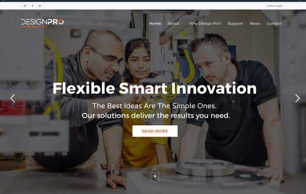
After months of hard work and research we’re delighted to be unveiling our new branding and company identity. It includes a new logo, a refreshed website design and an updated look and feel across our facility.
We’ve experienced phenomenal growth in recent years and towards the end of last year we began to evaluate the performance of our brand and question whether or not it represented who we are today. Our employee numbers have nearly doubled in the last twelve months from 25 to 47 and the recent move into a new 120,000 ft2 facility has meant we now have the capacity to take on larger projects and increase our multinational client base. This expansion has also allowed us to bring all our operations under the one roof resulting in a broadening of our offerings to our customers.
Taking all these factors into consideration we decided that now was the perfect time to do a bit of soul searching and clearly define exactly who and what we are about…and so began our brand identification project.
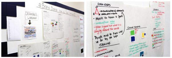
The rebranding process began earlier this year and involved gathering information and feedback from the people who are the influence behind what we do:
- DesignPro Key Personnel
- Our Customers
- The DesignPro Employees
Through a series of questionnaires, surveys and some very lively brand workshops we gained interesting insights into how the company was viewed from both an internal and external point of view. We analysed all this feedback and used it to form the basis of what has become the foundation of our new identity, our Brand Guidelines. This document is a clear concise document that outlines the core values of the company and defines the visual elements that reflect them.
The final result sees a fresh new look that captures everything we value as a company. It’s been in the works for over six months and we couldn’t be more delighted with the outcome.
Our new logo has an open style that gives a sense of stability and professionalism. It’s a minimal, modern, strong identity with a feel of creativity, you can almost see the name building in momentum as you read it. The circle represents motion and movement with the segments representing the continual processes that we specialise in creating. The introduction of the hint of orange reflects the bright, friendly, fun team that we are.
We couldn’t have achieved such a comprehensive understanding of who we are as a company today without the help of our staff and customers. They played a huge role in the development of the new brand, giving us great feedback in all our workshops and surveys (and we’d like to think they had a bit of fun along the way). We’d like to take this opportunity to say a big THANK YOU to them all!
Over the next few weeks we will be introducing our new brand throughout all our customer and supplier communication channels and we’re excited to see how our new identity will help you to get to know us a little better.
To see more of how this new look is transitioning across our different touch points check out our Facebook, Twitter and LinkedIn pages.
If you have any questions regarding the rebrand please feel free to contact us.

